Monday, August 12, 2019

Those Born to the Storm Progress IV

The last update that I provided on this painting occurred just as my family was moving out of our previous house. The great thing about my previous house was the amount of space that I was able to use as a studio, and it was a bit of a shock to move into a space that was less than half the size. Working on a painting of this size presents some particular difficulties in a smaller space. Thus, progress has been slow but steady. Recently I have been trying wake up a few hours before everyone else in the house does to work on individual sections before I go to work. Some weeks I am more successful at this than others.  I never thought that I would be able to wake up and work in this fashion, but I went to a few 6 AM Jiu Jitsu classes and had the realization that if I can wake up early to exercise then I can wake up early to paint. I am trying to finish this painting up within the next few months. I'm including a selection of different images throughout the evolution of the painting in the new space. 


Thursday, August 8, 2019

This Means Something


I have been interested in making a work of art with blood for a long time. Marc Quinn's blood portraits were extremely striking to me as a young artist. I saw the work of Jordan Eagles in 2007 which was beef blood poured over white plexiglass and they had beautifully rich red tones. I met the artist Allen Hampton a year later and saw some of his blood drawings which demonstrated to me that it was possible to control it as a drawing medium. The problem has always been acquiring the blood to work with, which always seemed like more of a hassle than it would be worth to me. Additionally, working with blood is such an extreme medium, I believed that it required a particular subject matter that would work in concert with the material. I serendipitously acquired both the concept for the drawing and a supply for the drawing material around the same time. 

This concept for the image arose from a session of joking around with my advanced oil painting students, when I thought of myself gleefully, lovingly even, looking back a skeleton as I give it a piggy back ride. I thought that this would be an interesting approach to creating a momento mori, which are typically much more meditative and somber images that invite the viewer to consider their own mortality. In this piece I have greeted death as a friend, and lovingly carry them along with me.

(in progress)
To create this piece I used cow's blood. I did what I could to try to separate the water from the hemoglobin, essentially I was trying to saturate the red pigmentation of the blood. I tried a few things, but nothing really worked. I suspect that I might be able to increase the red quality of the blood if I am able to obtain extremely fresh blood, however to do this I would be required to perform certain actions that I am not prepared to do at present. So in the meantime, I used a watery solution that was difficult to control and darken. The only way to darken the solution is to build up multiple layers, however it is not a material that lends itself to layering. You can also see how the color of the blood changed over time, initially appearing as having the orangish glow of transparent iron oxide. But as the iron in the blood continued to oxidized it took on a colder greenish brown tone, similar to a raw umber.


After I finished the initial drawing in blood, I felt that it didn't quite capture what I wanted to with either face. So I layered some color pencil over both figures. The color pencil creates a sense of reality, but the flatness of the drawing is emphasized by the simplistic approach to the rest of the figures. As the figures move towards the bottom of the paper, the color pencil fades away. All in all, I have to say, this piece.... it means something.

Wednesday, April 12, 2017

Born to the Storm Progress III

Unfortunately, the house we are renting is being sold, so instead of painting I have to pack.  This is going to push back the progress on this painting by quite a bit.  But I wanted to post my progress anyway.  This will be the first time that we will move within the same time zone and will definitely be our first time moving within the same city, so maybe it won't be as bad as it has been in the past. Anyway, I got a good amount of painting done during my Spring Break and wanted to show my progress before I pack up my art supplies.
this is the last photo I posted.


this is what I accomplished in the last week of March.

Monday, March 6, 2017

Rapt from the Fickle to the Frail


This painting is pretty obviously a tip of the hat to Edgar Degas, the subject is my sister-in-law who has been dancing for most of her young life.  For Degas, the ballerinas may just have been a beautiful subject that allowed him to capture wonderful lines, dancing attire and movement in his pieces.  But a ballet is about the coordination of elements that must be synchronized harmoniously  in order for the piece to work.  The dancer acts as a visual element in the work of art that is developed by the director, and they play the same role in Degas' paintings.

On a formal level, this painting was about my role as a director of visual elements for all of my paintings, and if you look at the landscape of contemporary figurative painters, you see several that think of their work in cinematic terms, that have said if they didn't paint they would make films (notably Vincent Desiderio and Bo Bartlett).  For a narrative to emerge from a static image, the artist must imbue the scene with context, and part of that context is the history of painting itself.  That is why I find it fitting to reference artists that I revere or are more significant to society at large.  

I felt as if my paintings had become too busy and wanted to make something a little bit quieter, with a lot of resting space above the figures.  I also knew that I wanted to use the mirrors to distribute space in a more interesting way, so that most of the figure would be cut off at the shins, but the subject would not be.  I also like the fragmentation of the image that happens with the subtle shifts in the angles of the mirrors.  It was important to me that the photographer be visible, and I loved how distorted her figure appears, and it was also important that I appear, acting as a kind of director of the scene. Part of me wonders if this painting would have worked better as a simple composition with three figures, I essentially lost my confidence in it's simplicity and created a more complex digital collage, which marked the first time that I've really incorporated digital media into my process.


This was the original photograph, featuring (L to R) myself, my wife, and her sister.  Part of me wishes that I had just painted this scene, but I am happy with the final piece, so I don't question myself too much.  This painting took a really long time to paint, for several reasons, but mostly because I just wasn't confident in the simplicity.  I kept wanting to add more and more to it.  Having the completely blank wall from the top of the mirror to the beginning of the ceiling was very bizarre to me, but the funny thing is, having all of that blank space is part of the reason that I wanted to make this painting in the first place.  


This is basically the image that i worked from, changing much of the information to fit my aesthetic sensibilities.  This painting was started in November 2015 and not completed until January 2017.  In addition to the reasons stated above, I also had other projects that took importance to me, this eventually just became a fixture in my studio, which I had to work around.  Eventually I decided that I was relatively close to finishing it, and just needed to dive in and complete it.  I still feel like there are some things about it that I'd like to adjust, but for the most part i'm happy with it, either way I learned a lot while making it.

Thursday, March 2, 2017

Self Portrait from Birthday Number Thirty

I took the photo for this drawing on my 30th birthday, two weeks before my son was born. I looked at the sink and countertop as a kind of metaphor for my life. At the time we didn't have a dishwasher in our kitchen and the sink was constantly filling with dishes, and it seemed like no matter how many dishes we cleaned there were always more.  This captured my wife and I because we had met and tied the knot, moved and had a baby in such rapid succession that it seemed like we couldn't catch up with our lives.  I also like the idea of my attributes being personified by the objects that I own and use, and the idea of illustrating a human presence without a human form.  I made the drawing with graphite and white colored pencil on toned paper, which is the same medium I used for my other drawing that illustrates human presence without form, "Mine Eyes are Homes of Silent Prayer".  I love creating drawings because I really get to push the relationship of flatness and form in a way that I wouldn't feel comfortable with in a painting.  Anyway, here is an example of my newest drawing "Self Portrait from Birthday Number Thirty", which I completed right on the cusp of birthday number thirty three.


 "Self Portrait from Birthday Number Thirty"
graphite and white colored pencil on toned paper
22" x 29"
2017


"Mine Eyes Are Homes of Silent Prayer"
graphite and white colored pencil on toned paper
22" x 27"
2014

Monday, January 30, 2017

Born to the Storm Progress II


I was extremely excited to begin this painting, but progress has been slower than I would like for a few reasons.  I was teaching a new lecture class which took an extraordinary amount of time, I went home for several weeks for the Christmas break, and I took a brief break to finish a different painting that I had started a year before.  Despite that I have made progress on the piece.

Essentially I have continued to block in colors, in several areas, while making adjustments for the color relationships as I move through the painting.  I have also began to paint in some of the toys in the foreground, and have decided that each of those toy tableau's, or toybleau's I guess, should be painted completely in one sitting.  But before i get too far into those I will need to figure out what i'm going to do for the floor.


Once I finished the other painting (Rapt from the Fickle to the Frail) I was able to use both of my easels to support the canvas.  This has been helpful in the process, and I am starting to hone areas to completion, the lower middle right side of the canvas for example.

Tuesday, October 18, 2016

Born to the Storm Progress Part I


I thought it would be a good idea to note my progress with this painting.  I've been wanting to begin this piece for such a long time that it was kind of surreal to actually start preparing the canvas.  I place a grid on the surface to help me place the drawing correctly.  I work from photographs and use a digital projector to transfer the drawing onto the canvas.  However, there is always some issues with lining up the photographic source with the canvas perfectly.  So I use grids like these to help place the imagery in the best possible manner.  Then I draw the contours and value information from the photograph onto the canvas.  


The next step involves blocking in the colors.  I really like beginning with a warm underpainting, with transparent iron oxide or burnt sienna.  Then I wipe away the light tones and establish the darks with burnt umber.  But for this painting, there is too much information to start that way, I am not able to spend enough time in one sitting to affect the entire painting effectively.  So I'm establishing some of the colors to establish the abstract color relationships that will help me balance the over all image.  This is where i'm at at this point, which is only a few hours into the painting process, but it feels so good to begin to see color emerge and the image start to make sense.  

Sunday, October 16, 2016

60 Americans Exhibition

I have a painting in an upcoming exhibition in Los Angeles CA.  It is the 2nd Annual 60 Americans exhibition which features... wait for it... 60 American Artists.  It looks like a really interesting survey of contemporary American art, I wish I could attend the opening on October 22nd.  If anyone is available to attend it is at the Makeshift Museum on 1855 Industrial Street.  


http://www.60americans.com/

Wednesday, September 21, 2016

What Did I Know of Love's Austere and Lonely Offices


This photograph for this painting was taken on my 30th birthday.  It was just over two weeks before my son was born.  I am seen here with my wife, at this point in our marriage we had only known each other for a year and a half (we met at the end of September and Got married at the beginning of June 8 months later, and got pregnant a month after that). This painting is meant to capture the heaviness of the situation and the conflicting feelings that I was experiencing at the time.  A new child was for me exciting and terrifying, it marked a new chapter in my life and in many ways spelled out an end to my freedom.  So I was filled with both eager anticipation and a sense of regret at the situation.  A bizarre dichotomy but one that is common to many soon to be parents, at least the one's that understand what parenthood entails.  Just to clarify, I love being a father, but I think the trepidation before becoming a parent is common and something that almost no one talks about.  The title of this piece was taken from this poem by Robert Hayden called Those Winter Sundays about a father's acts of thankless love.  This makes me reflect on my relationship with own father and think about what kind of father I want to be.

Sundays too my father got up early 
and put his clothes on in the blueblack cold, 
then with cracked hands that ached 
from labor in the weekday weather made 
banked fires blaze. No one ever thanked him. 

I’d wake and hear the cold splintering, breaking. 
When the rooms were warm, he’d call, 
and slowly I would rise and dress, 
fearing the chronic angers of that house, 

Speaking indifferently to him, 
who had driven out the cold 
and polished my good shoes as well. 
What did I know, what did I know 
of love’s austere and lonely offices?

Though I've experimented with, and even taught classes in watercolor before, this is
the first time that I've actually created a fully realized painting using watercolor.  I've documented the process to show the evolution of the piece.  I began by painting all of the shadows on my body blue.  Much of this was covered up in the final image, but I was careful to leave much of it around my neck.


As a quick update, this painting was accepted into a nationally juried show at an art center in Golden Colorado.  It was exciting, however, when I turned in the framed piece (shown above) they said that the frame was unacceptable and if I wanted to piece in the show I would need to reframe it.  Though this was disappointing I opted to just retract the piece from the show, instead of paying a couple of hundred dollars to have it put into a frame that I didn't like. 

I only bring it up to highlight part of the stigma that surrounds watercolor as a medium. The reason that my frame was deemed unacceptable wasn't because it was unprofessional, it was because it didn't fit their ideas of what a frame should look like. Many practitioners are mired in the traditions that have kept the medium from being relevant.  I say this, because at the very same time that this frame was rejected I had a drawing on display that was framed identically in an Internationally Juried Drawing Exhibition at a more prestigious art center in Denver, which was by far the most impressive show that I've ever been involved with, and they had no issue with the professionalism of my frame.

I know it sounds like i'm complaining about not being in the show, and yes, I am doing that a little bit, but after that experience it really made me want to make more watercolors, to push the medium into the 21st century.  There are a lot of amazing contemporary artists working in watercolor, but they really don't get much recognition.  It's a beautiful medium and I hope that it becomes more prevalent in the landscape of contemporary painting.  

Thursday, September 15, 2016

Those Born to the Storm Grow Weary of the Calm

I have begun the process of creating a new large scale painting, that was made possible in part by a grant from the Puffin Foundation.  I will be writing more about it as the process continues, but for now, I wanted to introduce the concept.  I was always struck by Francisco Goya's Disasters of War series.  This notion of revisiting the Disasters of War is not a novel one, Jake a Dinos Chapman did a large series directly related to the Disasters of War (sculptures below).  


My idea has been developing for about eight years, but I really began to hone it down into a solidified concept in 2014.  Since then, I have been moving, and unemployed, and a new father, and moving again, so my progress has been stalled to say the very least.  However, I am on the precipice, looking into the near future.  About to begin.  It's very exciting.  

To briefly explain, my concept stems from the notion of children (particularly young boys) that represent the sensibilities of those who wield great political and military power. Young boys have a habit of turning everything into a gun, or pretending to commit mass murder while emulating a cartoon character or hero of theirs.  Not to mention how they casually practice torture using their action figures.  We all remember how the vicious neighbor Sid tortured his toys like Combat Carl in Toy Story.  


This insight was partially awakened by the birth of my son and my realization of the nature of man.  But I had wanted to create painting from an epic battle scene with action figures since I was in graduate school.  I even went as far as to buy a giant box full of off brand GI Joes in the hopes that I would get around to it while I was there.  I never did.  The issue was that it didn't mean anything to me at that point.  I had no purpose to make such a painting, other than creating a battle scene, but it seemed like a far cry from my work.  It wasn't until my son was born that I really thought about how little boys play, or at least how I played when I was a little boy.  And how Sid from Toy Story wasn't especially sadistic, he just had a great imagination for toy torture.  When I thought about Sid I thought about Goya's Disasters of War and essentially knew immediately how I would handle it.  

The process has been kind of slow going.  Again, partially due to many major life changes, but also because of the practicalities of making such a piece.  I have to make it much larger than I normally work.  The vast majority of my paintings are 35" x 42", which wouldn't be large enough to communicate the toys in the proper pose.  I also had other artworks that I had already had planned to do, and some that just kind of came out of nowhere.  But the main reason it has taken awhile to really begin is that I don't want to rush the process.  My wife took the photograph that I am working from over a year ago.  Since then, I have edited into the photo the scenes from Disasters that I will be referencing.  Once I put those in place I recreated the scenes using action figures and other toys and then edited that into the picture in place of the original print.  I am taking time to make the composition works how I'd like it to.  I'm going into this project with the understanding that it will take a year to create.  It is the most ambitious painting I have made up to this point in my career.  

At this point I have made the canvas stretcher, stretched the canvas, and applied three coats of gesso.  I only have three more coats to apply and i'll be ready to begin.  The canvas is about 5 feet by 6 feet and BARELY fits down the stairs to go into my studio.  I plan on keeping this blog updated periodically with my progress, so here's the first shot.  Just waiting to be drawn on.


Wednesday, August 10, 2016

Update Denver

Just over 1 year ago, I relocated my family to Denver Colorado.  I have just finished my first year of teaching at Red Rocks Community College.  I have been making some things and wanted to update this blog.  The first is a drawing that I finished around Thanksgiving 2015.

Entitled "Breaking the Fourth Wall" this piece is meant to address the viewer directly from a figure in a location that is synonymous with looking.  As if the viewer and gallery attendees are the film that the figure in the drawing is watching.  The phrase "breaking the fourth wall" comes out of Theatre and Film criticism and refers to actors breaking the rationality of the theatrical world and acknowledging or even interacting with the audience (who sit behind the fourth wall).

The space is also meant to communicate the emotional state of the figure.  Surrounded by darkness and emptiness, the figure sits and waits to be entertained by the viewer.  On a technical level, I was interested in creating this piece because of the rich velvety black that I could achieve with the compressed charcoal, and how using middle grays could convey are full value spectrum, even though there are really no whites on the page.  Though i've made a drawings with charcoal during my time as a student, this is really the first charcoal drawing that i've made.


The second piece that I started is an oil painting of ballerinas, paying homage to Edgar Degas.  I started that in November 2016 and have yet to finish it, for several reasons, fatherhood, full-time teaching, unpacking boxes, studio in disarray etc.  Regardless, I think it's a strong painting, but it is continually put on the back burner for projects I get more excited about.  For instance, "Nature, Red in Tooth and Claw" which was actually the first piece that I started after moving to Denver.  It is a watercolor, which up to this point I had never really used for anything other than studies.  I began this in October 2015 and finished it around May 2016.  I'm not 100% sure that i'm satisfied with it yet, but i'm finished working on it.


During the process of making this piece, I made another watercolor entitled "What Did I know of Love's Auster and Lonely Offices".  It started as something to break up my time and work on intermittently, but I got really excited about it and eventually it pushed my other projects back so that I could finish.  I took in-progress photos and will publish a post specific to this painting so you can see how it evolved and read about it's meaning.  I am really happy with the result, and in fact, because I like this so much, I plan on working on more and more watercolors.


Tuesday, March 10, 2015

The Painting Life

If anyone is interested in taking a weekend long, intensive workshop from me, I'll be teaching one at the Appalachian Center for Craft this Summer.  If you're interested check it out here


Friday, January 23, 2015

Cross Over: On the Future of Drawing & Painting Education

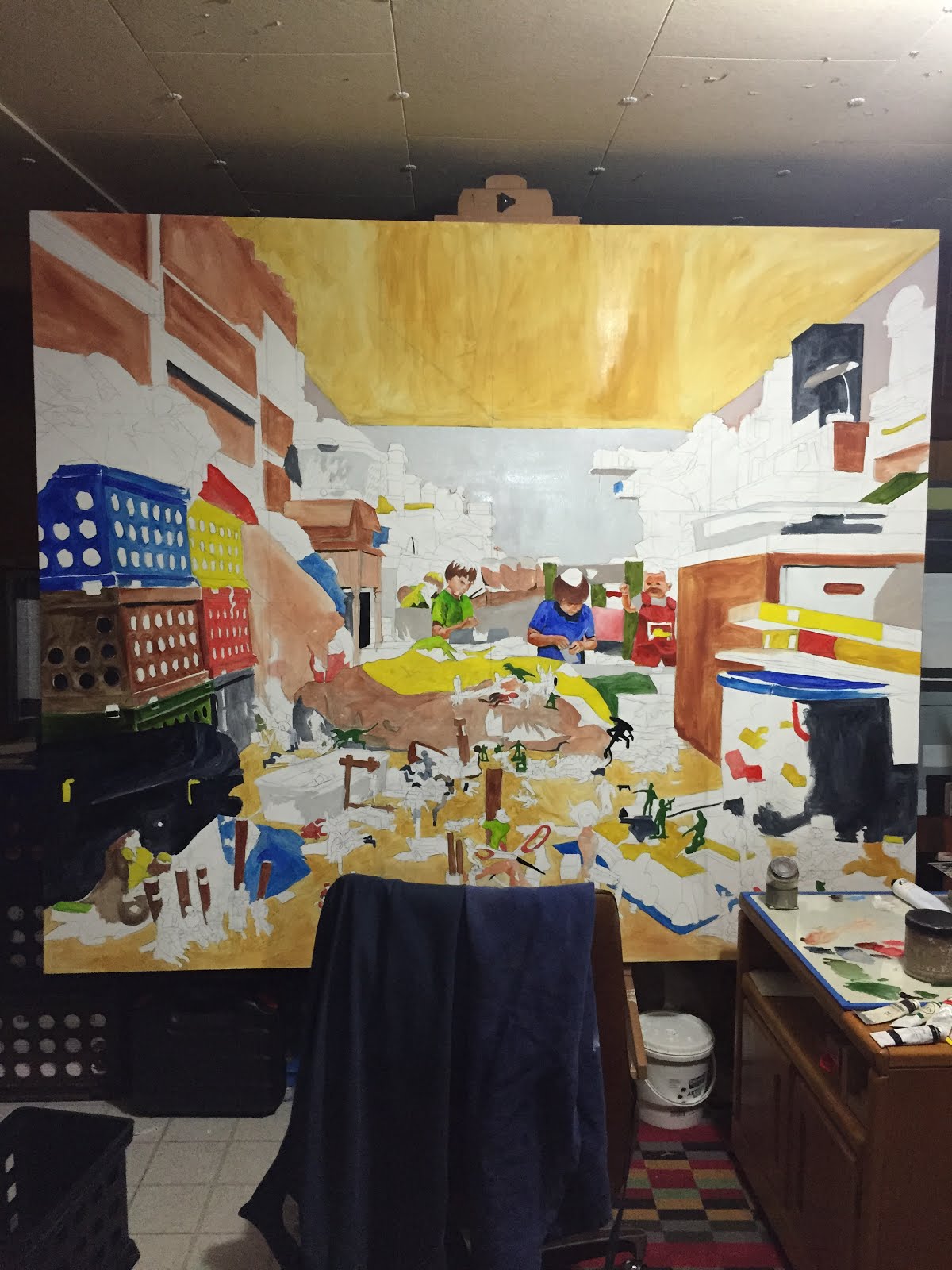
As a traditionally trained painter and draftsman, the use of computer drawing tools has seemed at best not applicable and at worst anathema to my art training.  However the incorporation of digital drawing and painting technology into the traditional studio seems inevitable.  This inevitability will probably aggravate and sadden the purists teaching today, but I have begun to see major areas where traditional and digital drawing techniques intersect.  This has done more to excite the educator in me than the artist, but I imagine I will start using it as a tool in my painting process at some point.  As an educator I have only taught a handful of students that are interested in my specific major (Painting), and of those I haven't taught one that is specifically interested in the things that interest me.  This is a good thing.  Making Studio Art appeal to broad swaths of the population is challenging, but extremely rewarding when you're able to see how painting, industrial design, and chemistry majors are all engaged by the subject matter.  The majority of my students (at least at the time) were pursuing photography and graphic design, many of which were great students but questioned how they could use the course material in their career.  Since beginning this foray into the digital realm I have begun to find answers to these questions, and have been considering the possibilities of merging the two worlds in a studio program.  I haven't found the exact answer to how one would combine traditional and digital approaches into a single studio context, but I understand that it is the future of the medium.  I don't think for a second that Painting will be replaced by the medium known as "Digital Painting", because the products are too different, but I have found that the techniques used in Digital Painting have the potential to be extremely useful in Painting pedagogy.

The extent of my experience at this point has been limited to Adobe Photoshop and Illustrator, with some use of a Wacom drawing tablet in each program.  The majority of what I'd like to talk about involves Illustrator, but I think that I have only begun to explore Photoshop's applicability for painting, so there may be an update to this post in the near future.

I was immediately struck by the similarities between building up painting and a vector illustration.  To begin I didn't place any limitations on myself as far as how many colors I could use because I had no plans to print the result.  I think that is an important difference between how a painter should use the program versus a designer or printmaker.  I used a portrait of a friend and examined the image for it's essential values, colors and shapes in exactly the same way. First I outlined contours of the face of a similar value and hue, starting with lighter values and layering increasingly darker tones on top.  After completing my first vector illustration I felt like the process would be very beneficial for any painting student, but especially for graphic design students struggling with the concepts of painting.  Below you will find a few of the first vector illustrations I have made, the third is really intended to emulate building up a portrait as a painter would, shape by shape.


Achieving the correct value range is the most important aspect of creating dimensionality, and it is most often the most difficult thing for students to understand.  Very often the issue is that even if students see the correct values, they blend all of the paint in an object to achieve something that, at best, looks like a Linear Blend on Illustrator but doesn't actually communicate any planar shift.  I believe that students would be more prone to not make this mistake if they:

-make vector illustrations from photographs with pronounced light sources
-with at least 6 different and distinct values 
-with at least 6 different and distinct hues
-and create at least 3 of these vector illustrations 

The second technique with digital and physical applications is planar analysis.  Often called Polygonal drawing when created by a computer, it is the same idea, breaking down planes of an object into its essential polygons (non organic shapes).  I have found that students have a very difficult time with this assignment, particularly when asked to draw a complicated object.  However I believe that this difficulty is largely a result of physical limitations to beginning students.  Planar analysis drawings from life are very difficult, but they are extremely helpful in drawing and essential to painting.  Using Illustrator to create Polygonal drawings would eliminate the physical restrictions and allow the students to make more accurate renderings.  The drawback is that, if students are making these drawings directly from a photograph then they are ultimately robbing themselves of developing their hand eye coordination with regard to physical mark making.  However, while I believe that that is true to a certain extent, the most important thing that students can develop in a Drawing class is their ability to SEE.  If students are able to understand planar shifts from a photograph then they will certainly be able to see them from life.  The key here is not allowing students to turn in unacceptable renderings.  A quick google search of polygonal portraits will reveal a glut of examples of "digital artists" not understanding how planes work.  Behold, I give you some of those examples (note: these are just some of the first images I found on a google image search, i have no idea who the artists are):


To avoid this catastrophic failure any drawing or painting studio that incorporates digital tools must develop both approaches simultaneously.  I think the key is to keep digital programs in the right place.  They will not and cannot replace the art object, but they can help you to build the art object better.  If students can correctly decipher planar shifts their understanding of the three dimensional world will be greatly enhanced, which will most certainly improve their art making skills in general.  Below I have attached a polygonal portrait I made of my father as well as two planar analysis drawings that I made from the same photograph.


In the process of making this piece, I came to realize that if students learned how to break down the planes of the face in this manner they could translate that into making paintings in the tradition of Lucian Freud, Euan Uglow, Jenny Saville, Ann Gale, Hanjo Schmidt and a host of others.


 Jenny Saville
 Lucian Freud
 Euan Uglow
 Ann Gale
Hanjo Schmidt

When I attended undergraduate I never thought that these Digital tools would be used in tandem with a traditional Painting or Drawing class.  As a graduate student I only feared that they would be, but now as a professor I can see that they most certainly will be.  It is only a matter of time.  Seemingly every other field of visual arts (save ceramics) has been aided by the incorporation of digital technology, it is foolish to think that it will not affect painting or drawing.  The question then, is HOW will it be incorporated?  How do you construct a class that is partially painting studio, with its toxic fumes and messiness with expensive machines.  How does a professor cover the basics of Adobe Illustrator on top of teaching all of the intricacies and particularities of oil painting?


I have some ideas about how to handle these questions, and will address them in another post, but the truth is that it will probably mean that a Painting Student has a vastly different kind of education in the future.  I believe that this change will be for the better of students and Painting as a medium.  Change is good, it is a sign of life, it is an exciting time to be an Art Student.  Let's see what the future holds.