http://www.60americans.com/
Sunday, October 16, 2016
60 Americans Exhibition
I have a painting in an upcoming exhibition in Los Angeles CA. It is the 2nd Annual 60 Americans exhibition which features... wait for it... 60 American Artists. It looks like a really interesting survey of contemporary American art, I wish I could attend the opening on October 22nd. If anyone is available to attend it is at the Makeshift Museum on 1855 Industrial Street.
Wednesday, September 21, 2016
What Did I Know of Love's Austere and Lonely Offices

Sundays too my father got up early
and put his clothes on in the blueblack cold,
then with cracked hands that ached
from labor in the weekday weather made
banked fires blaze. No one ever thanked him.
I’d wake and hear the cold splintering, breaking.
When the rooms were warm, he’d call,
and slowly I would rise and dress,
fearing the chronic angers of that house,
Speaking indifferently to him,
who had driven out the cold
and polished my good shoes as well.
What did I know, what did I know
of love’s austere and lonely offices?
the first time that I've actually created a fully realized painting using watercolor. I've documented the process to show the evolution of the piece. I began by painting all of the shadows on my body blue. Much of this was covered up in the final image, but I was careful to leave much of it around my neck.


As a quick update, this painting was accepted into a nationally juried show at an art center in Golden Colorado. It was exciting, however, when I turned in the framed piece (shown above) they said that the frame was unacceptable and if I wanted to piece in the show I would need to reframe it. Though this was disappointing I opted to just retract the piece from the show, instead of paying a couple of hundred dollars to have it put into a frame that I didn't like.
I only bring it up to highlight part of the stigma that surrounds watercolor as a medium. The reason that my frame was deemed unacceptable wasn't because it was unprofessional, it was because it didn't fit their ideas of what a frame should look like. Many practitioners are mired in the traditions that have kept the medium from being relevant. I say this, because at the very same time that this frame was rejected I had a drawing on display that was framed identically in an Internationally Juried Drawing Exhibition at a more prestigious art center in Denver, which was by far the most impressive show that I've ever been involved with, and they had no issue with the professionalism of my frame.
I know it sounds like i'm complaining about not being in the show, and yes, I am doing that a little bit, but after that experience it really made me want to make more watercolors, to push the medium into the 21st century. There are a lot of amazing contemporary artists working in watercolor, but they really don't get much recognition. It's a beautiful medium and I hope that it becomes more prevalent in the landscape of contemporary painting.
Thursday, September 15, 2016
Those Born to the Storm Grow Weary of the Calm
I have begun the process of creating a new large scale painting, that was made possible in part by a grant from the Puffin Foundation. I will be writing more about it as the process continues, but for now, I wanted to introduce the concept. I was always struck by Francisco Goya's Disasters of War series. This notion of revisiting the Disasters of War is not a novel one, Jake a Dinos Chapman did a large series directly related to the Disasters of War (sculptures below).


My idea has been developing for about eight years, but I really began to hone it down into a solidified concept in 2014. Since then, I have been moving, and unemployed, and a new father, and moving again, so my progress has been stalled to say the very least. However, I am on the precipice, looking into the near future. About to begin. It's very exciting.
To briefly explain, my concept stems from the notion of children (particularly young boys) that represent the sensibilities of those who wield great political and military power. Young boys have a habit of turning everything into a gun, or pretending to commit mass murder while emulating a cartoon character or hero of theirs. Not to mention how they casually practice torture using their action figures. We all remember how the vicious neighbor Sid tortured his toys like Combat Carl in Toy Story.

This insight was partially awakened by the birth of my son and my realization of the nature of man. But I had wanted to create painting from an epic battle scene with action figures since I was in graduate school. I even went as far as to buy a giant box full of off brand GI Joes in the hopes that I would get around to it while I was there. I never did. The issue was that it didn't mean anything to me at that point. I had no purpose to make such a painting, other than creating a battle scene, but it seemed like a far cry from my work. It wasn't until my son was born that I really thought about how little boys play, or at least how I played when I was a little boy. And how Sid from Toy Story wasn't especially sadistic, he just had a great imagination for toy torture. When I thought about Sid I thought about Goya's Disasters of War and essentially knew immediately how I would handle it.
The process has been kind of slow going. Again, partially due to many major life changes, but also because of the practicalities of making such a piece. I have to make it much larger than I normally work. The vast majority of my paintings are 35" x 42", which wouldn't be large enough to communicate the toys in the proper pose. I also had other artworks that I had already had planned to do, and some that just kind of came out of nowhere. But the main reason it has taken awhile to really begin is that I don't want to rush the process. My wife took the photograph that I am working from over a year ago. Since then, I have edited into the photo the scenes from Disasters that I will be referencing. Once I put those in place I recreated the scenes using action figures and other toys and then edited that into the picture in place of the original print. I am taking time to make the composition works how I'd like it to. I'm going into this project with the understanding that it will take a year to create. It is the most ambitious painting I have made up to this point in my career.
At this point I have made the canvas stretcher, stretched the canvas, and applied three coats of gesso. I only have three more coats to apply and i'll be ready to begin. The canvas is about 5 feet by 6 feet and BARELY fits down the stairs to go into my studio. I plan on keeping this blog updated periodically with my progress, so here's the first shot. Just waiting to be drawn on.

Wednesday, August 10, 2016
Update Denver
Just over 1 year ago, I relocated my family to Denver Colorado. I have just finished my first year of teaching at Red Rocks Community College. I have been making some things and wanted to update this blog. The first is a drawing that I finished around Thanksgiving 2015.


Entitled "Breaking the Fourth Wall" this piece is meant to address the viewer directly from a figure in a location that is synonymous with looking. As if the viewer and gallery attendees are the film that the figure in the drawing is watching. The phrase "breaking the fourth wall" comes out of Theatre and Film criticism and refers to actors breaking the rationality of the theatrical world and acknowledging or even interacting with the audience (who sit behind the fourth wall).
The space is also meant to communicate the emotional state of the figure. Surrounded by darkness and emptiness, the figure sits and waits to be entertained by the viewer. On a technical level, I was interested in creating this piece because of the rich velvety black that I could achieve with the compressed charcoal, and how using middle grays could convey are full value spectrum, even though there are really no whites on the page. Though i've made a drawings with charcoal during my time as a student, this is really the first charcoal drawing that i've made.

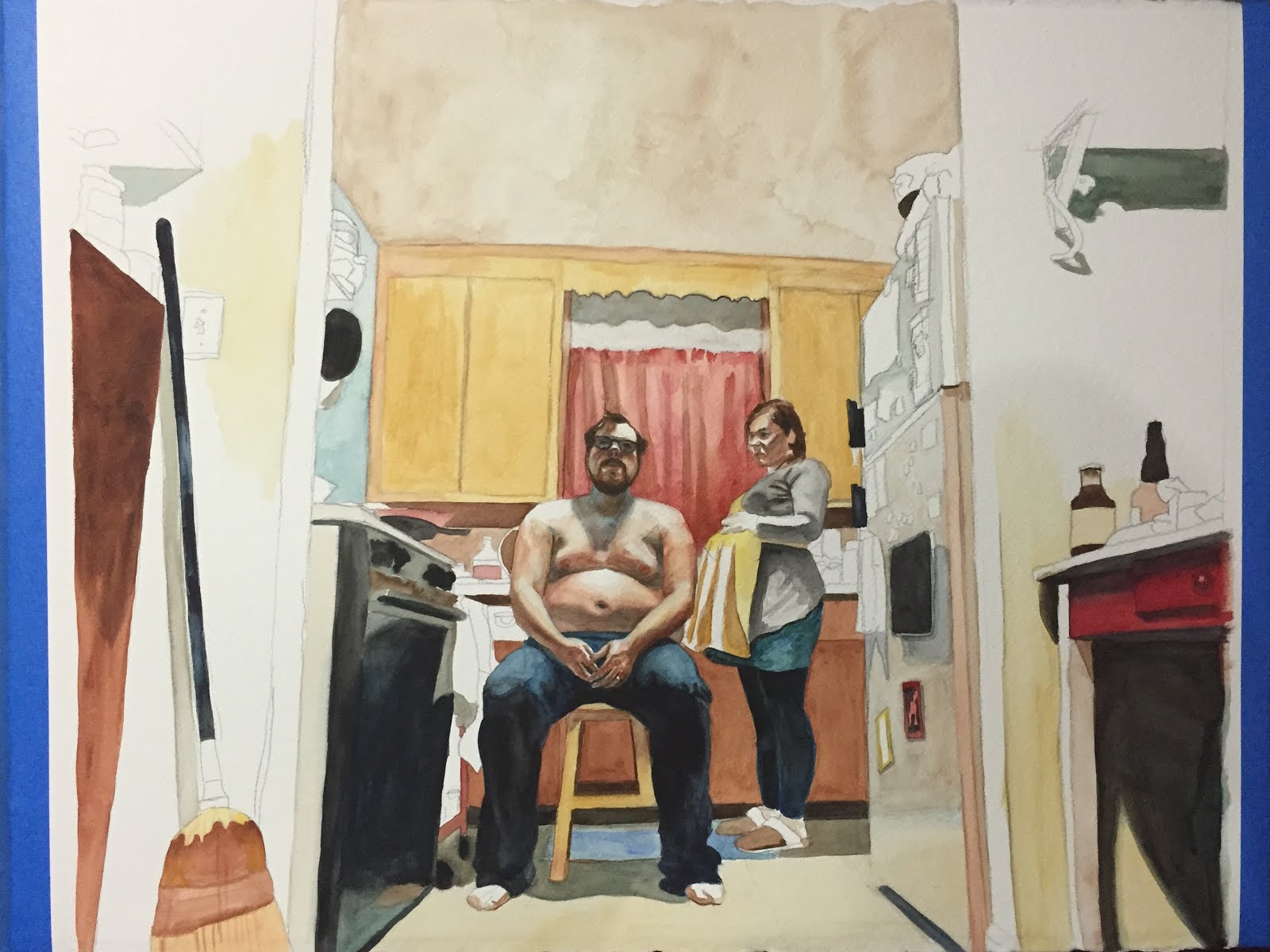
The second piece that I started is an oil painting of ballerinas, paying homage to Edgar Degas. I started that in November 2016 and have yet to finish it, for several reasons, fatherhood, full-time teaching, unpacking boxes, studio in disarray etc. Regardless, I think it's a strong painting, but it is continually put on the back burner for projects I get more excited about. For instance, "Nature, Red in Tooth and Claw" which was actually the first piece that I started after moving to Denver. It is a watercolor, which up to this point I had never really used for anything other than studies. I began this in October 2015 and finished it around May 2016. I'm not 100% sure that i'm satisfied with it yet, but i'm finished working on it.

During the process of making this piece, I made another watercolor entitled "What Did I know of Love's Auster and Lonely Offices". It started as something to break up my time and work on intermittently, but I got really excited about it and eventually it pushed my other projects back so that I could finish. I took in-progress photos and will publish a post specific to this painting so you can see how it evolved and read about it's meaning. I am really happy with the result, and in fact, because I like this so much, I plan on working on more and more watercolors.


Tuesday, March 10, 2015
The Painting Life
If anyone is interested in taking a weekend long, intensive workshop from me, I'll be teaching one at the Appalachian Center for Craft this Summer. If you're interested check it out here

Friday, January 23, 2015
Cross Over: On the Future of Drawing & Painting Education
As a traditionally trained painter and draftsman, the use of computer drawing tools has seemed at best not applicable and at worst anathema to my art training. However the incorporation of digital drawing and painting technology into the traditional studio seems inevitable. This inevitability will probably aggravate and sadden the purists teaching today, but I have begun to see major areas where traditional and digital drawing techniques intersect. This has done more to excite the educator in me than the artist, but I imagine I will start using it as a tool in my painting process at some point. As an educator I have only taught a handful of students that are interested in my specific major (Painting), and of those I haven't taught one that is specifically interested in the things that interest me. This is a good thing. Making Studio Art appeal to broad swaths of the population is challenging, but extremely rewarding when you're able to see how painting, industrial design, and chemistry majors are all engaged by the subject matter. The majority of my students (at least at the time) were pursuing photography and graphic design, many of which were great students but questioned how they could use the course material in their career. Since beginning this foray into the digital realm I have begun to find answers to these questions, and have been considering the possibilities of merging the two worlds in a studio program. I haven't found the exact answer to how one would combine traditional and digital approaches into a single studio context, but I understand that it is the future of the medium. I don't think for a second that Painting will be replaced by the medium known as "Digital Painting", because the products are too different, but I have found that the techniques used in Digital Painting have the potential to be extremely useful in Painting pedagogy.
The extent of my experience at this point has been limited to Adobe Photoshop and Illustrator, with some use of a Wacom drawing tablet in each program. The majority of what I'd like to talk about involves Illustrator, but I think that I have only begun to explore Photoshop's applicability for painting, so there may be an update to this post in the near future.
I was immediately struck by the similarities between building up painting and a vector illustration. To begin I didn't place any limitations on myself as far as how many colors I could use because I had no plans to print the result. I think that is an important difference between how a painter should use the program versus a designer or printmaker. I used a portrait of a friend and examined the image for it's essential values, colors and shapes in exactly the same way. First I outlined contours of the face of a similar value and hue, starting with lighter values and layering increasingly darker tones on top. After completing my first vector illustration I felt like the process would be very beneficial for any painting student, but especially for graphic design students struggling with the concepts of painting. Below you will find a few of the first vector illustrations I have made, the third is really intended to emulate building up a portrait as a painter would, shape by shape.


Achieving the correct value range is the most important aspect of creating dimensionality, and it is most often the most difficult thing for students to understand. Very often the issue is that even if students see the correct values, they blend all of the paint in an object to achieve something that, at best, looks like a Linear Blend on Illustrator but doesn't actually communicate any planar shift. I believe that students would be more prone to not make this mistake if they:
-make vector illustrations from photographs with pronounced light sources
-with at least 6 different and distinct values
-with at least 6 different and distinct hues
-and create at least 3 of these vector illustrations
The second technique with digital and physical applications is planar analysis. Often called Polygonal drawing when created by a computer, it is the same idea, breaking down planes of an object into its essential polygons (non organic shapes). I have found that students have a very difficult time with this assignment, particularly when asked to draw a complicated object. However I believe that this difficulty is largely a result of physical limitations to beginning students. Planar analysis drawings from life are very difficult, but they are extremely helpful in drawing and essential to painting. Using Illustrator to create Polygonal drawings would eliminate the physical restrictions and allow the students to make more accurate renderings. The drawback is that, if students are making these drawings directly from a photograph then they are ultimately robbing themselves of developing their hand eye coordination with regard to physical mark making. However, while I believe that that is true to a certain extent, the most important thing that students can develop in a Drawing class is their ability to SEE. If students are able to understand planar shifts from a photograph then they will certainly be able to see them from life. The key here is not allowing students to turn in unacceptable renderings. A quick google search of polygonal portraits will reveal a glut of examples of "digital artists" not understanding how planes work. Behold, I give you some of those examples (note: these are just some of the first images I found on a google image search, i have no idea who the artists are):


To avoid this catastrophic failure any drawing or painting studio that incorporates digital tools must develop both approaches simultaneously. I think the key is to keep digital programs in the right place. They will not and cannot replace the art object, but they can help you to build the art object better. If students can correctly decipher planar shifts their understanding of the three dimensional world will be greatly enhanced, which will most certainly improve their art making skills in general. Below I have attached a polygonal portrait I made of my father as well as two planar analysis drawings that I made from the same photograph.


In the process of making this piece, I came to realize that if students learned how to break down the planes of the face in this manner they could translate that into making paintings in the tradition of Lucian Freud, Euan Uglow, Jenny Saville, Ann Gale, Hanjo Schmidt and a host of others.


In the process of making this piece, I came to realize that if students learned how to break down the planes of the face in this manner they could translate that into making paintings in the tradition of Lucian Freud, Euan Uglow, Jenny Saville, Ann Gale, Hanjo Schmidt and a host of others.
Jenny Saville
Lucian Freud
Euan Uglow
Ann Gale
Hanjo Schmidt
When I attended undergraduate I never thought that these Digital tools would be used in tandem with a traditional Painting or Drawing class. As a graduate student I only feared that they would be, but now as a professor I can see that they most certainly will be. It is only a matter of time. Seemingly every other field of visual arts (save ceramics) has been aided by the incorporation of digital technology, it is foolish to think that it will not affect painting or drawing. The question then, is HOW will it be incorporated? How do you construct a class that is partially painting studio, with its toxic fumes and messiness with expensive machines. How does a professor cover the basics of Adobe Illustrator on top of teaching all of the intricacies and particularities of oil painting?
I have some ideas about how to handle these questions, and will address them in another post, but the truth is that it will probably mean that a Painting Student has a vastly different kind of education in the future. I believe that this change will be for the better of students and Painting as a medium. Change is good, it is a sign of life, it is an exciting time to be an Art Student. Let's see what the future holds.
Monday, November 24, 2014
Drawing
Since August I have not had access to a studio space. Because of this I haven't been able to make paintings, but that hasn't restricted me from creating work. I've been investigating and experimenting with drawing, although I have always made drawings, they were usually simply in support of a painting. I think this is a fine use of a drawing, but i also appreciate the aesthetics of drawings that stand alone. So I decided that it was time to jump back in to this primary mode of expression. Before I found myself in my current sans studio state i was excited about being restricted to making drawings. I can produce them relatively quickly, I can approach an image in several different ways, and I have a lot of freedom to make something different from anything i've tried before.
To break down the process a little bit, I use painters tape to adhere a piece of drawing paper to foam-core. This gives me a rigid, but soft surface to press against, allowing me to have a huge value range. This also allows me to work on the drawing in a much more casual manner, since I am not strapped to an easel I can move to a comfortable couch and sit down to draw, or move rooms when there are too many distractions. To allow for more mobility I am using graphite exclusively, because charcoal would make too much of a mess.
Before I begin each drawing I begin with a grid system on the paper, this helps me with the placement of composition. I could erase it when I have the final product, but I like maintaining a kind of history to the drawing. You can see it a little bit in these drawings from 2012.


%2Bcopy.jpg)
The Starry Heavens Above and the Moral Law Within
35" x 42"
One Among the Many
24" x 30"
These drawings were really great to do, and I really like them, but they are a little more straight forward, and the paper is adhered directly to a very heavy wooden panel. So they aren't as mobile. I want my drawings to play with dimensionality and flatness in the same way that my paintings do. So I made this drawing, also in 2012.
Some Sort of Ghost in the Machine
36" x 24"
I loved focusing on the contours and line weights, with just enough dimension to make it stand out. This drawing became the inspiration for the work that I would make a couple years later.
How Far Then, Shall We Say, That the East is From the West
24" x 36"
This is the first and last drawing I made at my studio space in Minneapolis, it is also the last drawing I made on an easel. The paper was stretched and glued over a very heavy, but beautifully made (if i do say so myself) panel, prior to drawing. I wasn't initially going to leave the background as simple as it is, but I was planning on making the clothes less detailed. I'm really happy with the drawing as it is, but I've learned that there is a real art to understanding what NOT to do. I'm still learning that.
Below are the three drawings that I have made since i've been without a space. The first is a study for what will be more like the two drawings above, but it was really fun to play with mark making, and seeing how much information i could convey while keeping a loose hand. The other two are pieces that kind of occurred to me, as if I knew exactly how I was going to approach them as soon as I sat down to draw. This has been a really fun way to approach making images, I think it has weaseled its way into my artistic practice so expect more in the future. in the mean time i hope you enjoy these pieces and check my website for more in the future.
Nature, Red in Tooth and Claw
22" x 26.5"
Mine Eyes are Homes of Silent Prayer
22" x 26.5"
On the Threshold of Distinction
29" x 35"
Subscribe to:
Posts (Atom)